Background
Monitoring activity over time in one of our client’s accounts, we noticed a trend: occasional, unusual high value conversions seemed to be followed by notable fluctuations in key metrics such as CPC (Cost-Per-Click) and ROAS (Return on Ad Spend) over the following week(s).
While auction dynamics inherently lead to some degree of fluctuation in performance metrics over time, this appeared to be a recurring pattern, which prompted us to investigate further.
Business Context
Given the scale and complexity of the account, understanding the nuances of performance metrics is crucial to maintaining efficiency. As such, it’s worth noting that this account:
- Relies on an internal reporting and attribution setup, rather than purely using platform data from Google.
- Is relatively mature, with server-to-server (S2S) conversions being utilised to send conversion values back to Google Ads.
- Uses a maximise conversion volume with a tROAS (Target Return on Ad Spend) bid strategy almost across the board.
Hypothesis
We hypothesised that the extremely high-value conversions which were substantially above the AOV were misleading Google’s bidding algorithm, causing it to overestimate the market presence of high-value users and bid more aggressively to find more similar-value users. This aggressive bidding led to higher CPCs and, consequently, a reduced ROAS.
Seeing that those high-value conversions were outliers, and not indicative of a genuine change in user value, we wanted to test the impact of limiting Google’s response to them. By doing this, we aimed to reduce their influence on bidding signals, leading to fewer fluctuations in performance and avoiding unwarranted/ unprofitable spikes in CPCs.
By already using server-to-server conversions, we had a way to artificially limit how high the value we sent back to Google could be. By doing this and limiting the anomalous values being recorded, we assumed we could reduce the negative impact of those inflated CPCs, thereby improving ROAS.
Approach to Data Censoring
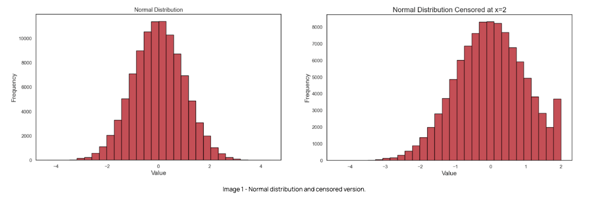
The following histograms provide a visual representation of how the conversion value distribution is impacted in a right censoring scenario, i.e. when a ceiling is applied to the largest values, using an example dataset.
Image 1 shows a plot of a normal distribution, with the majority of values centred around a mean of 0 and a standard deviation of 1. Image 2 shows how the same distribution is represented when a ceiling of x=2 is applied, converting values larger than this to the ceiling value. As expected, the frequency of values at x=2 increases substantially.

Analysis
We began by analysing conversion values across relevant paid search campaign categories, which are highly correlated with the types of journeys users can go through.
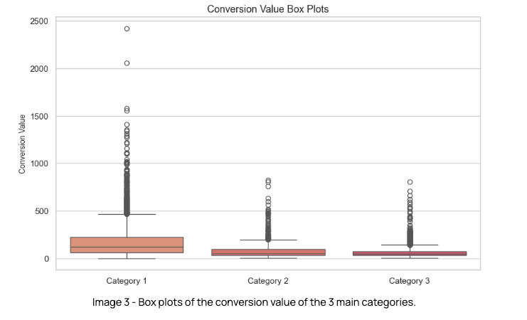
The goal here was to understand a few characteristics regarding distribution, such as the presence of outliers. To conduct this analysis, we took a representative sample of the conversion value of the 3 main campaign categories, for the last 45 mature days.
As we evaluated the data, we noted a couple of key insights around the conversion value distribution:
- The conversion value of all categories is positively skewed (i.e. right-skewed), meaning that the mean and median are greater than the mode, with the distribution stretching towards higher values.
- There were several outliers across all categories.


Our goal was to implement a ceiling value to remove outliers from these distributions. But how could we best assess the most appropriate value to use as the ceiling?
Capping the value distribution
At this stage is where sensibility comes into play, as the threshold after which a value should be capped is relatively arbitrary. We wanted to cap values that would be considered extreme in the distribution, while retaining the signal of what it means to be a high value for the algorithm.
In Table 1 we can see the following for each category’s distribution:

90th percentiles & 95th percentile
These are statistical measures that indicate the value below which x% of the data points in a given dataset fall. This means that the 90th percentile, for example, is the point that separates the first 90% of the distribution from the remaining 10%.
Upper Fence
The upper fence is found using the following formula, where Q3 is the third quartile in the distribution and IQR (or Interquartile Range) is the difference between Q3 and Q1:
![]()
It’s established that points after this limit are considered outliers in a distribution. A similar method is applied to find outliers in the lower end of the distribution.
The 90th percentile was considered too aggressive a change for an experiment of this nature, so we were left with 2 possible approaches:
-
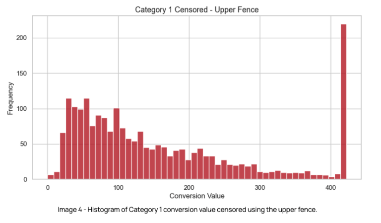
- Using the upper fence, i.e. the upper boundary after which values are considered to be outliers.
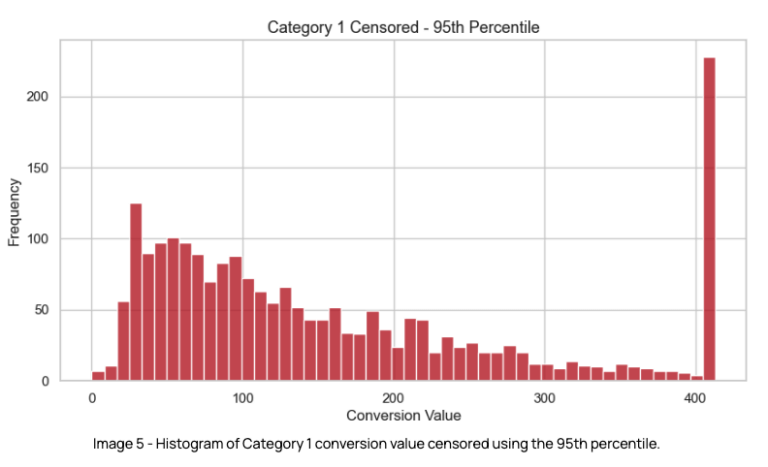
- Capping values at the 95th percentile.
At this point, it was also determined that we would focus on testing our hypothesis exclusively in the largest paid search campaign in category 1, as this was the largest campaign in the account, providing enough volume for a meaningful result in a shorter period of time.
Using the upper fence as the ceiling
- Using this point as the capping threshold, an estimated 9% of conversions across the 3 categories would be impacted.
- From the analysis, if applying the upper fence to cap the distribution, we would be uploading close to 13% less conversion value to Google.

Censoring values at the 95th percentile
- Using this value we would implement a slightly more aggressive ceiling than using the upper fence i.e. it would be lower in all categories.
- We expected this ceiling value to still be high enough to not have an impact on the bidding signal sent to Google.
- Using the 95th percentile we expected to impact ~10% of conversions and reduce conversion value by ~14%.

Ultimately we ended up favouring the 95th percentile as the ceiling, as it was slightly more aggressive without compromising ROAS or proving to be too much of a risk to the campaign’s performance.
These changes were introduced to the offline conversions pipeline, applying the respective ceiling value to each category.
Results
We conducted the experiment over 4 months, in order to ensure we gathered sufficient data to be able to validate the results at a statistically significant level and achieve acceptable confidence and power levels.
Throughout this period the distribution of conversion value was analysed, and the 95th percentile ceiling was updated accordingly. This was due to the dynamic nature of this metric, as a result of factors such as business decisions, seasonality or other experiments running simultaneously, to name a few examples.
The results of the experiment on the main performance metrics were as follows:
-
-
- CPC: decreased by 9%
- CPA: decreased by 13%
- AOV: increased by 3%
- ROAS: increased by 26%
-
There was improved performance across almost all key metrics, though total revenue decreased by 15% due to a 20% reduction in traffic. However, given both efficiency metrics and conversion rates have improved significantly for the censored version, the experiment results were determined to be a clear success given business goals and therefore gave enough confidence for an account-wide rollout of the strategy.
Final thoughts
The outlier value capping test provided interesting insights that run a counter-narrative to a traditional value bidding approach & exemplify how experimenting with conversion value signals can lead to interesting results. Optimising the data that is sent to Google can in fact be a lever that can be pulled in order to drive up performance efficiency.
We’re looking forward to taking this even further, with a next phase of the experiment planned that will involve dynamically adjusting the outlier threshold to account for changes due to seasonality, performance fluctuations, and predicted revenue.
If you have any questions regarding this experiment, please feel free to reach out to us via our contact page.